Consumer-facing Dashboard Redesign for Privacy Bee
2024
Project Timeframe: 2 Weeks
Team Members: 2
Introduction
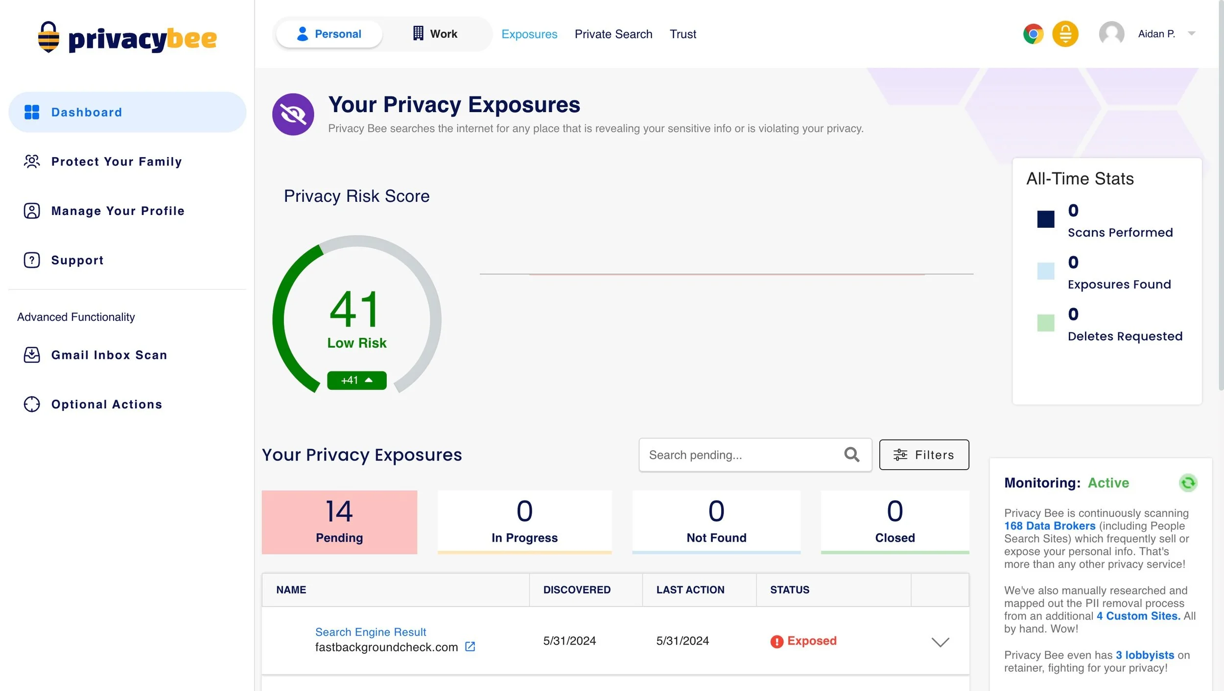
Privacy Bee specializes in removing personally identifiable information (PII) from the internet. Data brokers aggregate and sell data on millions of Americans, enabling targeted ads, identity theft via social engineering, and unauthorized account access by hackers. I was tasked with redesigning the consumer-facing dashboard, where thousands of users go every day to check the status of their removals.
The Challenge
Privacy Bee was having an issue with customer churn rate. When I joined the team, we were averaging around 29% churn on our pro subscribers. I set a goal to get this number to 15%, as that was around the industry average at the time.
Research
I began by collecting a list of users that canceled subscriptions, as well as the reason for cancellation. I also scheduled interviews 3 users that had recently canceled their subscription.
Analysis
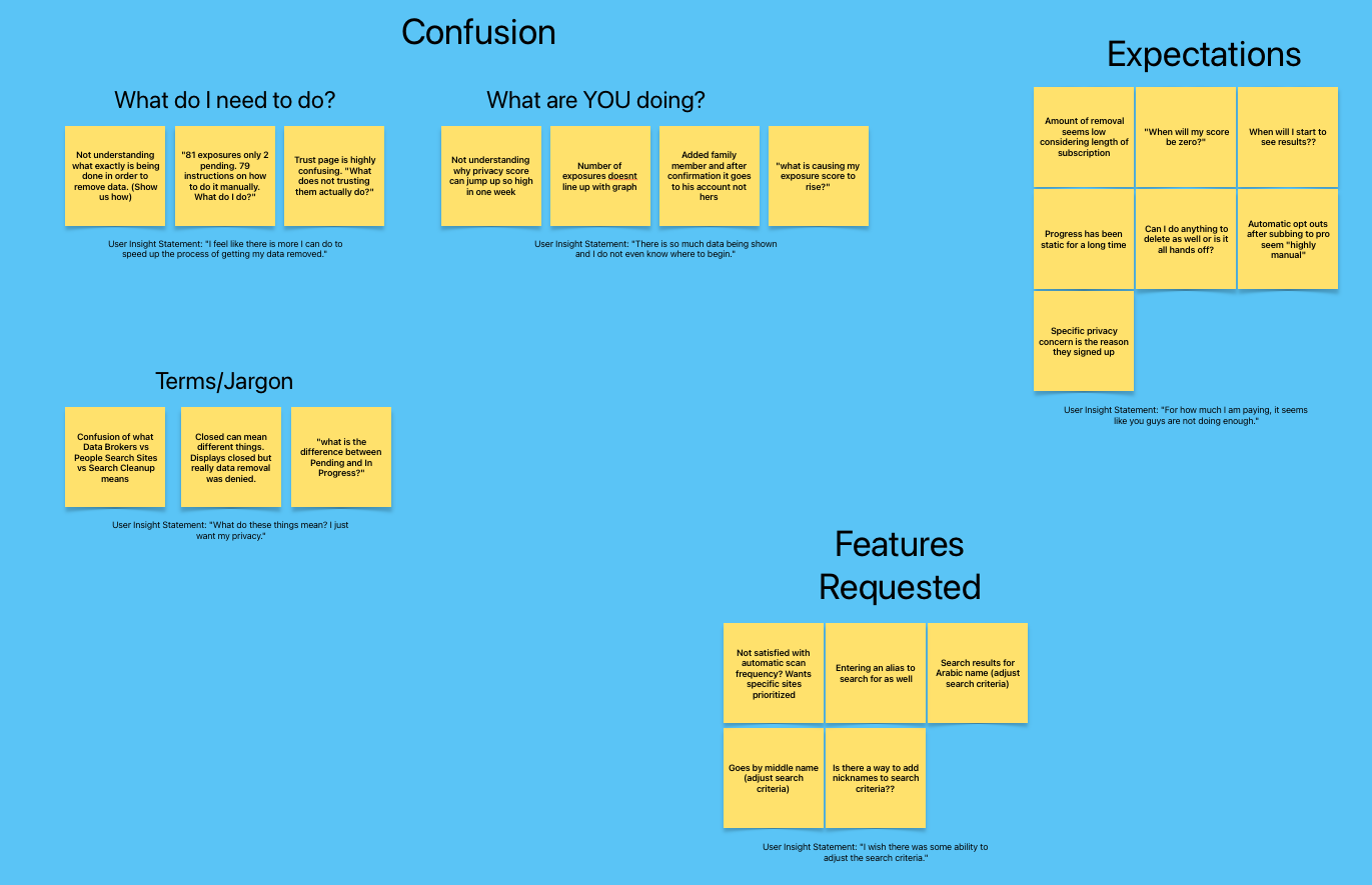
Service is too expensive.
The service is “not doing enough”.
The dashboard is too confusing to look at.
Users did not understand what certain industry jargon meant.
I organized the insights gathered into a table, sorting them by reasons for cancellation. There were 4 key reasons for canceling subscriptions:
Design
In this redesign, we prioritized simplicity and clarity to ensure users could easily navigate and understand their removal request status. We implemented informative tooltips and progress indicators to guide users through the process step-by-step, reducing uncertainty and building trust. Real-time updates were integrated for transparency, keeping users informed instantly. Accessibility was ensured by following WCAG guidelines. This approach ensured the dashboard met user needs effectively, enhancing usability and satisfaction.
Solution
The key changes we decided to make on the dashboard were:
Restructuring the dashboard to draw user eyes to the most important information first.
Replacing the clunky graph with a “Privacy Forecast”. This details users journey’s with privacy bee over a year, giving them a projection of how we will improve their digital footprint.
Stripping the industry jargon and simplifying the activity feed.
Adding an Optional Actions & Suggestions block, allowing users to choose to add more information to their profile, increasing the efficacy of our scans.
Reskinning the UI to a more user friendly and cleaner interface.
Feature Highlight
〰️
Feature Highlight 〰️
Suggestions & Next Steps
Suggestions & Next Steps is an easy way to draw engagement on the dashboard, placing control in the user’s hands to tailor their experience exactly how they want it. There is a list of 20 optional actions, ranging from Removing specific search results to Adding a secondary address. When all 20 steps are completed, this increases the rate of successful removals by ~15%.
Privacy Forecast
This feature was what we decided on as the easiest way to show progress over time with the service. Through testing, we were able to validate that it properly set the expectations with the user, helping them understand that Privacy Bee’s services were not an overnight thing. During the first year of the subscription, it tracks a full projection of the remainder of the year. Once you have reached one year, it fixes the indicator to the center of the graph, showing a 6 month history, as well as a 6 month progression.
Removal Progress
These four cards are the key features in understanding the progress Privacy Bee makes in removing your data from the internet, so it was important to get right. We needed a way to simplify it, without stripping away the information that matters. We decided to implement trends on each card, furthering the expectation setting with users.
Testing
I faced challenges with stakeholders over usability testing methods. I advocated for direct user interaction over a few days to test task completion, while executives preferred launching the dashboard as-is, adjusting later. To resolve this, I compromised by soft-launching to a select user group and A/B testing metrics like engagement, support requests, and pro subscription amounts between the two groups. Soft-launching allowed us to mitigate risk, and still gather empirical data to inform design decisions.
Some quotes from our support emails:
“The new privacy bee dashboard is a cut above the other data privacy companies”
“I am highly thankful for this update, thanks for helping and increasing the level with your hard efforts”.
Once the dashboard was fully launched, we kept track of some key KPIs. these included:
Churn Rate of Pro Subscriptions
Average engagement time between the old dashboard and the new one
Whether or not new subscriptions had increased.
Learnings & Takeaway
The largest takeaway I had from this project was navigating pushback from Stakeholders. Finding the medium between what you believe to be the best option, and what the constraints are for a given project is as much of a part of the design process as user research.


